24 May Growth with the Engagement Pyramid
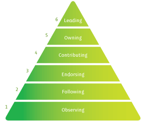
When designing or managing social communities, the engagement pyramid is a common model to understand the behaviour of your community members. Here’s one from Groundwire:

Basically, the pyramid represents all you community members, with the most engaged and committed at the top and the least engaged at the bottom.
The same model can be used to think about the users of your product.
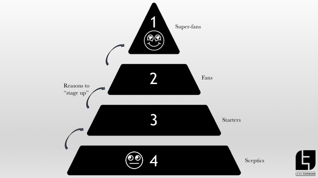
When modelling growth for your product, it’s a good exercise to construct an engagement pyramid and split it up into sections, like this:

With this model as a base there are three things you can do that will help you grow your user base and understand your users better:
- Give each segment a name that describes the user type. In the picture above, we use generic terms, but for example a drawing app can have “artists” at the top and “doodlers” at the bottom.
- List the (measurable) behaviour for each segment. How do we know someone is an “artist” in our drawing app? Perhaps they spend a certain amount of time in the app? Perhaps they produce a certain number of drawings? Make sure you measure the behaviour in your analytics tool.
- Describe how you can help a user in each segment “stage up”. Now add features that will help users climb up in the engagement pyramid. This way you know what you’re already doing to help people be more engaged, or experiments you would like to make to test how to drive more engagement. The book Hooked by Nir Eyal is a good read for this.
The top of the pyramid is typically much smaller than the base. The “1% rule” states that in a social app, 1% of the users are “creators”, 9% are “contributors” and 90% are “lurkers”. This ratio has been debated but as a rough estimate it’s good enough. In fact, if the top of the pyramid is “too wide”, maybe you can segment it even more?
Building a sharper product
There’s another important point with the engagement pyramid: it helps you build a “sharper” product. Failing this can severely limit your growth rate! If you find it hard to nail down one clear top of the pyramid but instead discover that you have multiple ways for users to be more engaged, there’s a major risk your product is too complex and suffers from the “Swiss army knife” syndrome.

Ultimate Swiss army knife…
This is when you have a product that is somewhat good at many things, but not extremely good at one thing. You’re trying to please everyone which leaves you with the risk of pleasing no one. It’s much harder to get “super fans” with too many pyramids. If having users that love your product is part of your growth strategy (it should be) then you’re up for a rough ride.
There may be circumstances where this is called for, such as complex enterprise apps or products that are regulated but in general I highly suggest you build for one (or a few) user type(s) with one specific engagement pyramid to climb. If you’re struggling with growth, this is one the first things you should analyse: what “pyramids” do I have and what do they look like? Should I remove some and simplify the product?
Yes, that’s right: the key to growth may very well be to remove features!
Once you have a significant user base you can start exploring how to please other user types and expand the product. But not until then.
To see this in practice, let’s continue with the drawing app example. Let’s assume you find that you have three major user types:
- Children
- People who want to draw something funny on a photo, like a clown nose on a friend
- Drawing artists who want to improve their craft
It’s extremely difficult to create super-fans from all three categories if you want to please them all. You will always be forced to make compromises in the features you build and even in the tone of voice, the design and general UX of the application.
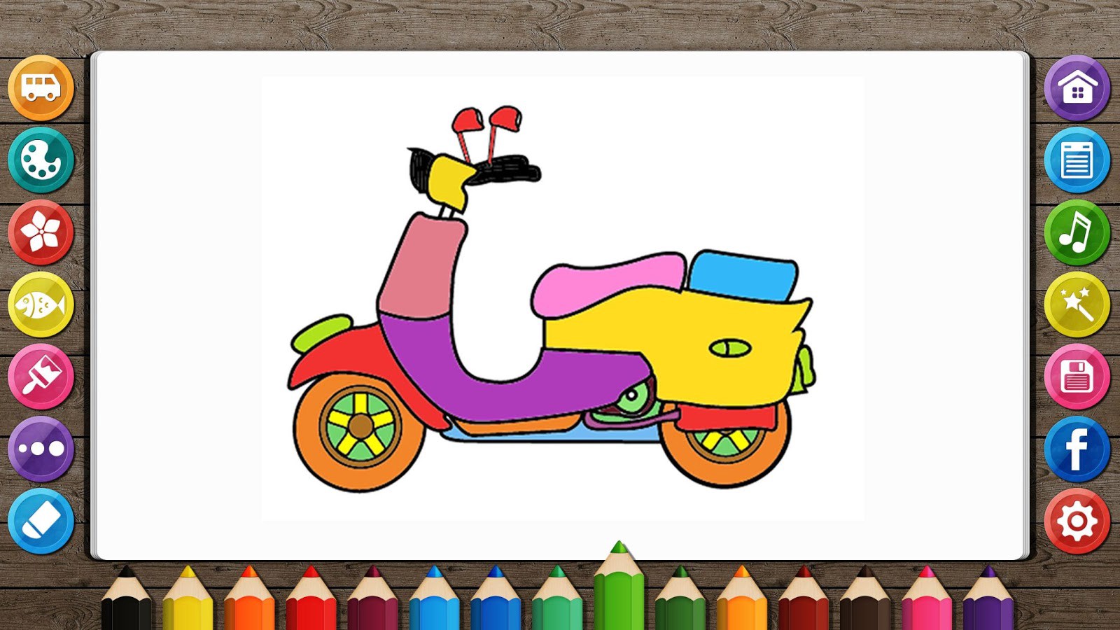
This is what kids love to see in a drawing app:

Drawing Desktop
While this is what an artist wants to see:

Pixelmator
Actually, the top app Drawing Desk solves this in a fairly nice way by having different user modes, but that still introduces risk since it adds complexity to the app. Complexity is confusion and confusion means less growth. Your pyramid should be sharp and pierce through the mind of your user as a knife through butter. It should be immediately obvious to the user what you can do for her and why she should pick you. That’s the Product Promise and it can be different for each segment in the pyramid, but it should be obvious none the less.
Once you’ve nailed behaviour modelling, you can start growth modelling and business modelling to run experiments and learn more about your customer using the LUNA Loop. Have fun!
(Pyramid Photo by Ruth Tate).


